

We’ll revisit this airport later in the post. But, before you read ahead, do you notice anything odd about it?
A quick glance at a sectional chart will show a plethora of information for pilots. One of the key items on all aeronautical charts is the airports… Most pilots know that airports with long runways are shown with a box-shaped icon outlining the runway complex, whereas airports that feature shorter runways are displayed with the runway complex within a circle.
Some of the studious pilots that have spent considerable time reading the aeronautical chart legend may even know that airports with runways longer than 8,069 feet are those shown with the outlining around the runway complex in the approximate shapes of rectangles, where as airports with hard-surface runways in length from 1,500 feet to 8,069 feet are shown with the runway complex inlayed in a circle shape.
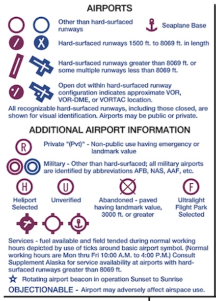
These box and circle outlines are color coded with magenta icons indicating that the airport does not have a control tower, whereas airports shown in blue feature a control tower.

The shape of the airport icon is not related to the airport having an operational control tower, as can bee seen in this image where the Holloman Air Force Base with a 12,900 foot long runway is shown with the rectangle icon and the Alamogordo-White Sands Regional Airport (KALM) with a 9,200 foot long runway is also shown with a rectangle airport icon. Since ALM is shown is magenta, pilots know that there is no control tower at the airport.
Each airport icon has an associated information block located close by, sometimes in crowded areas these info data blocks are linked with the use of a dotted line… One of the items within the data block is the length of the longest runway, rounded to the nearest 100 feet. However, typical rounding rules are not followed here. Runway distances are rounded using 70 as the division point. Thus, a runway that is 8,069 feet would be charted as “80” and a runway with a length of 8,070 feet would be charted as “81”.

Circled in red is the dotted line connected the airport info block for Schenectady County Airport to the airport icon. This area in New York is quite crowded on the chart, thus leading to the dotted line for the info block.
You may be asking yourself, is this odd rounding rule employed by he FAA the tipping point for the shape utilized to highlight the airport on the chart too? Well, the reality of the situation is much more simple…
The icons on the chart are designed to actually provide useful navigational information, as much as possible anyways. The icon is designed to reflect what a pilot would see out the window, to scale. This is something, I wrote about previously, in the blog post titled “The Art of the (Aeronautical Chart… What you see versus reality!” The post was published here on ReviewBeforeFlight on 9/30/2015. I recommend you read the entire post from the “The Art of the Chart” series, but you can scroll down to item number two for more details on this specific topic.

Circled in yellow is the runway length for the North Central West Virginia airport (CKB), 7800 feet, a quick look at the airport icon shows that the runway which runway roughly Northeast to Southwest stretches almost all the way across the airport icon circle.
Thus, what is displayed within the airport icon is what the pilot sees out the window, further the entire runway complex layout, even closed runways, are included and shown to scale. So a runway that is on the shorter side, say 3500 feet would appear as shorter within the circle airport icon, where as an airport icon for an airport with a runway more than 7,000 feet long would show the runway stretching almost entirely across the circle. Thus, the size of the circle chosen for the airport icon on sectional charts allows for a runway that is up to 8,069 feet long to be shown to scale. Once a runway reaches 8,070 feet, rounded to 8,100 feet the runway would stretch beyond the limits of the circle, thus the circle is dropped in lieu of outlines for the runways, or the “rectangle effect”.
So, as Paul Harvey used to say on the radio, “Now you know the rest of the story…”
-Fly Safe, @MTElia1B9
BONUS: I found this during the research for this blog post…
You’ll notice the Cavern City (CNM) airport features a longest runway of 7800 feet, obviously less than the 8,070 feet needed for the “rectangle shaped” airport icon on the Sectional chart. In this case the cartographers faced a challenge of showing all runways to scale. Due due to the very unique runway complex layout they had to drop the circle icon because the runways as laid out would extend beyond the circle icon associated with the geographical 8,069 feet diameter. Thus, this airport, without a runway at least 8,070 feet long is shown with the “rectangle” type icon as opposed to the circle…
BONUS 2, 1/9/19: Special thanks to ReviewBeforeFlight reader, and one of my good friends, Adam Scott for pointing out the Brunswick Executive Airport (KBXM) in Maine. This airport features two parallel runways of 8,000′ by 200′. Due to the space between the runways this layout wouldn’t fit within the circle icon and as such the box-style depiction was utilized on the New York Sectional Chart. Also worth noting that one of the runways in indefinitely closed. However, the icon will not switch to the circle because the chartogrqpherrs work to depict, as close as possible, what us pilots will see out the windows and since we’d see two runways, albeit one with big yellow X’s, the icon will remain depicting the two strips.


Very good info. Lucky me I found your blog by accident (stumbleupon).
I’ve saved as a favorite for later!