
Let me start this installment with a statement, which may on its surface seem like “fighting words”… Knowing the meaning of each and every symbol on aeronautical charts doesn’t make you a good pilot, or even a smart pilot… Now before you dismiss this assertion on the surface, let me explain.
Any time you are preparing for a flight, similar to while you’re flying, you have a chart, if not, then you’re doing it wrong… Do you know what is attached to that chart? Correct, the legend of symbols, carefully outlining the meaning. What’s more…? When a pilot takes a written exam and a chart is used as part of a question, do you know what ais part of the test supplement supplement? …Right again, the chart legend! Shocking? …Not really…
Amazing, that the FAA would provide this critical information in so many ways! Well again, not really… Over time, and seeing the same things again and again you’re bound to remember symbols and what each letter and number means on the chart. From the obvious, the difference between the two object symbols for towers, one used for towers less than 1,000’ AGL (above ground level) and the other for towers greater than that… All the way to the less common, like the ‘R’ that can appear after a frequency above a VOR’s information.
Over time with experience you’ll remember and learn more and more until you’ve earned your masters degree in aviation symbology… So let’s take a look at some “trivia” like knowledge that will impress others and make you more knowledgeable when you’re using charts…
Again, as with the last installment of “The Art of the Aeronautical Chart…”, this post isn’t the end all, be all of chart knowledge. Just the opposite in fact. These are some commonly overlooked details… The things that during my many years of teaching and flying with others, I’ve noticed are commonly lacking from their aeronautical knowledge, motivating me to share these items with readers here!
- Tick marks
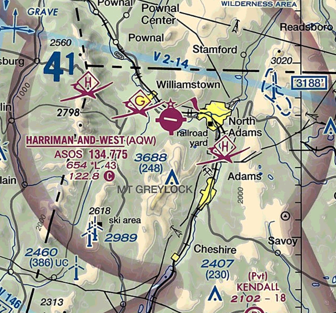
The North Adams airport in Massachusetts, known as Harriman-and-West (KAQW). A really cool place to visit…
Take a look at the above screen grab from Foreflight over the airport in North Adams, Massachusetts. A very cool place to visit, by the way… Incredibly close to the summit of Mt. Greylock (the highest point in Massachusetts)!
You’ll notice the “tick” marks around the airport symbol. I’m sure you’re saying, “Yeah, that means there is fuel there and some additional basic services!”
You’d be correct too, but do you know when these services are available? A smaller group of readers will be saying, “Yeah, during normal business hours!”
Correct again, but for these purposes, “normal business hours” don’t mean 9am-5pm… Instead, the ticks indicate that fuel and other basic, essential services are available between 10am and 4pm, local time. The worker in me says, gee I wish I could find a place that recognizes that type of workday, with an hour-lunch, you’re only looking at a 5-hour workday!
- What you see vs. what’s there…
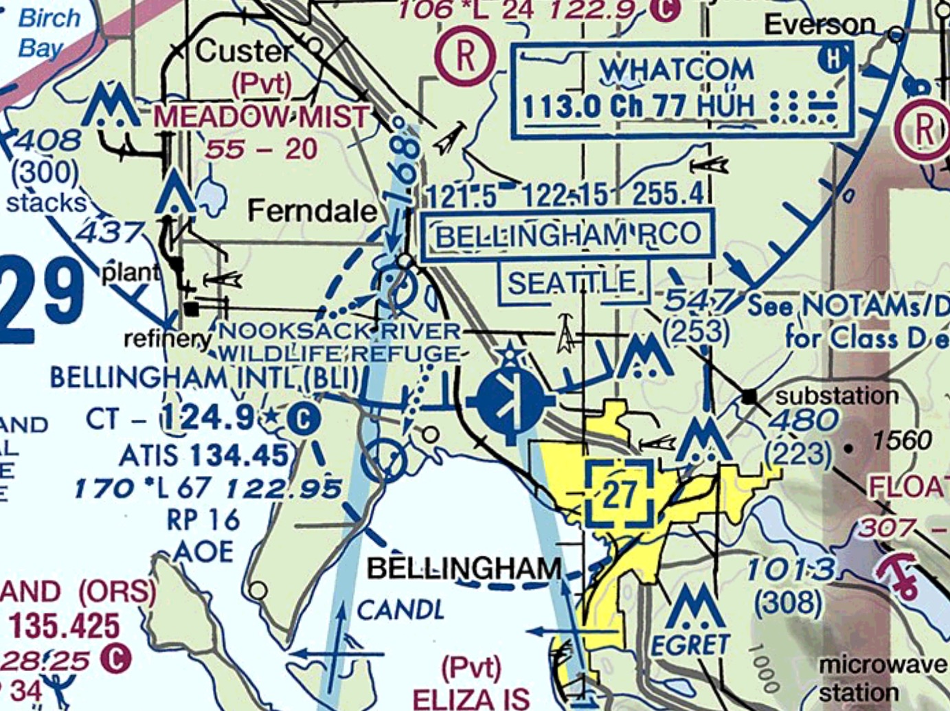
I noticed the Bellingham International Airport (KBLI), because of its shape, looking like a backwards “K” on the chart…
The above image is another screen shot from Foreflight, this time of the Bellingham International Airport in Washington state. Looking at that image you’d think there are 3 runways available… Essentially aligned as a backwards “K”, but this is not the case. Here is the airport diagram for Bellingham:
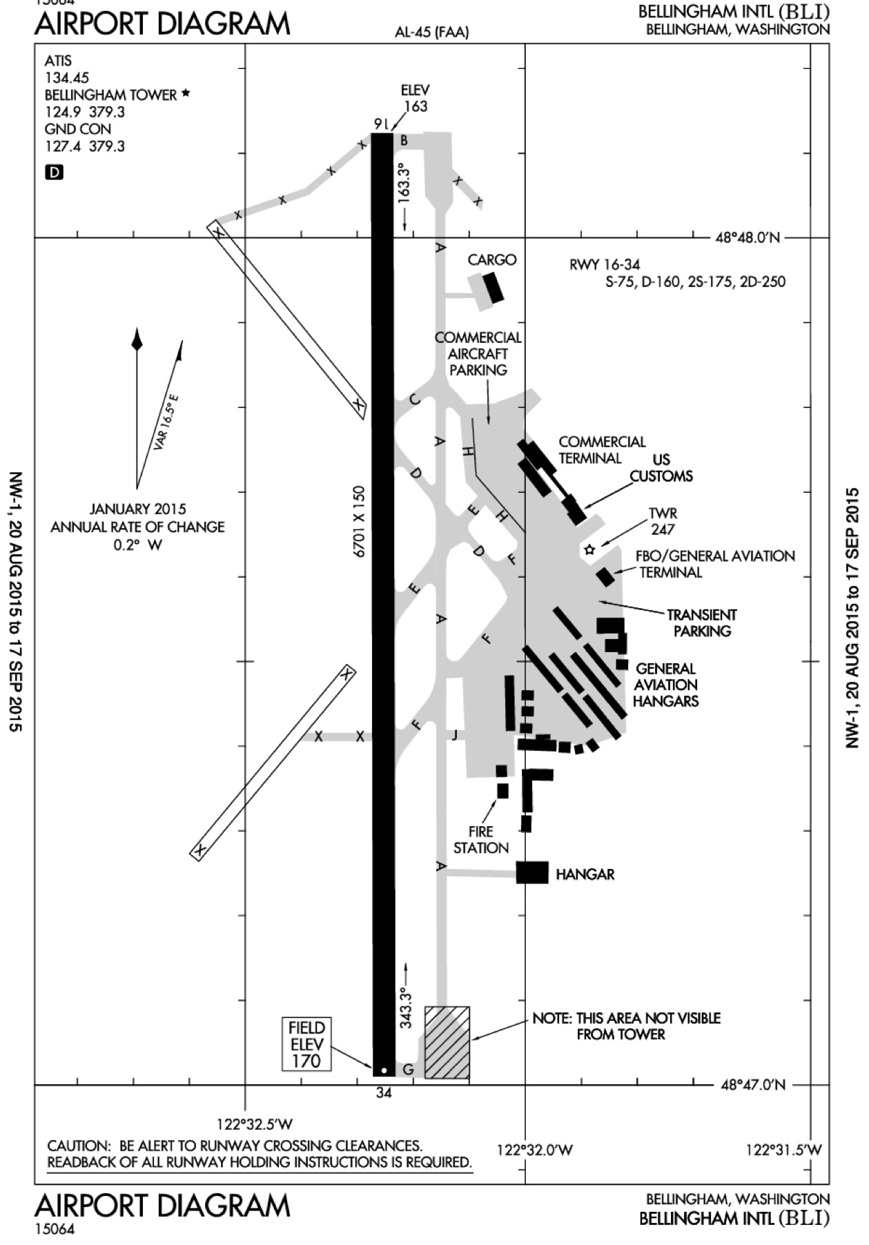
You will notice two things: 1. There is only one runway that is in use. 2. There are two closed runways that are shown on the airport diagram, designated as closed with “X’s”, and as a result not useful for aircraft operations.
This begs the question, why chart closed runways? Again a simple answer follows… Just like the cartographers shade relief to show what it may look like from the air, closed runways at airports are included for the same reason. From above the idea is that the pavement layout on the ground that is seen from the aircraft’s windows should match the design on the chart. As a result, closed runways that are still intact, typically remain as part of the airport symbol.
- Things aren’t always what they seem…
Closed airports are included on aeronautical charts, but maybe not for the reason you first think… Obviously a closed airport, may be a good emergency landing site, something that was a runway is probably better than another area which was never maintained for aircraft operations.
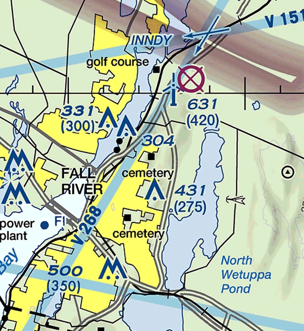
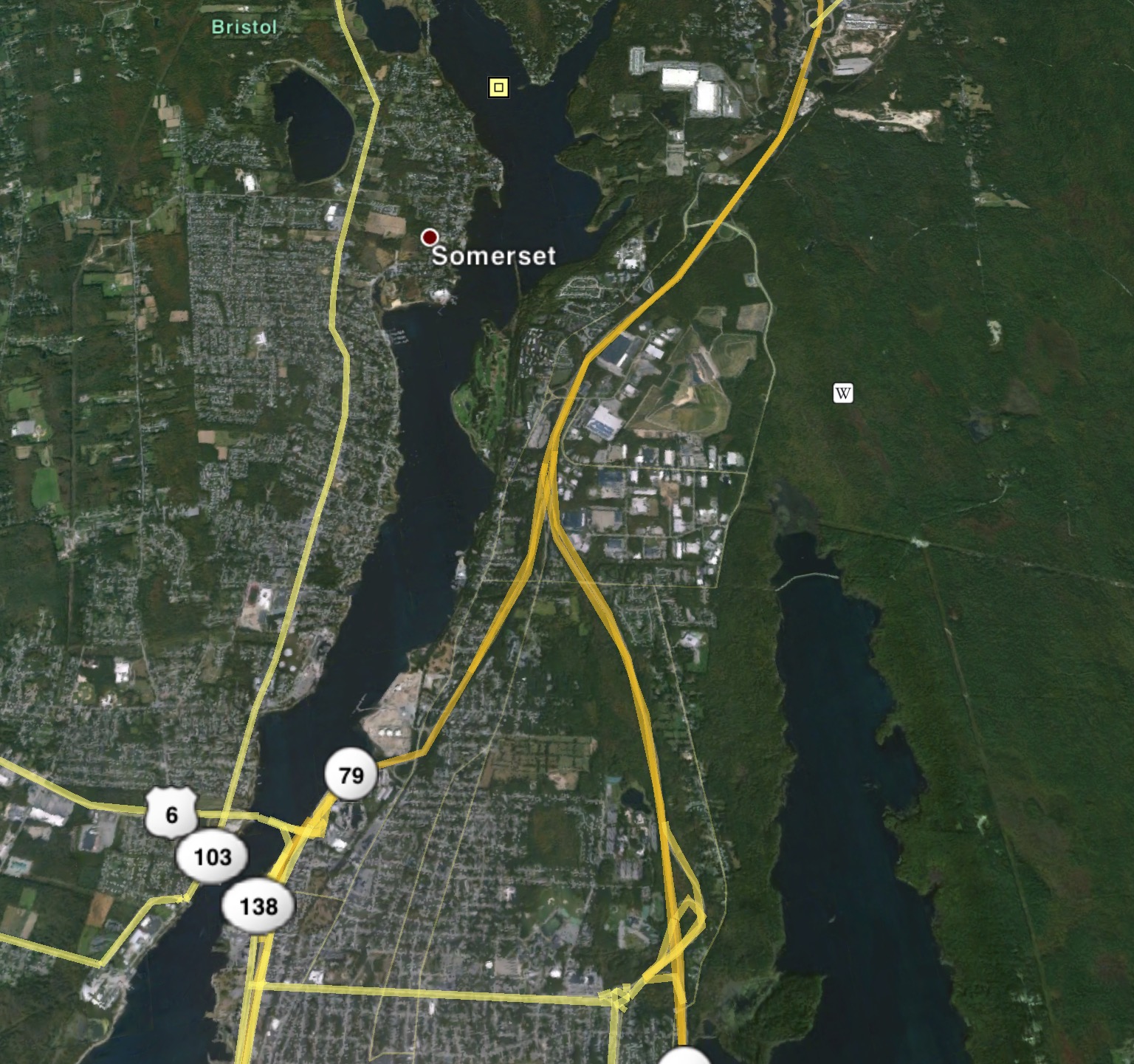
A standard closed airport symbol overlying the location of the former Fall River Municipal Airport in Massachusetts.
But, the main purpose of including closed airports on aeronautical charts is for their navigational value. The closed airport will only be included if it has “navigable” value… Said a different way, if the former airport still looks like an airport, or some distinguishing portion remains intact, the closed facility will continue to be included on the chart. Once no sign of the facility remains, the closed airport symbol should be removed… Sometimes the distinguishing portion can be tough to determine though. As an example, the former Fall River, MA airport remains charted (image from ForeFlight above), yet all the remains is the smallest portion of the crosswind runway… Take a look, you’ll probably need to see the final image to notice the remanence of the former airport.
Google Earth from above, see the former airport?
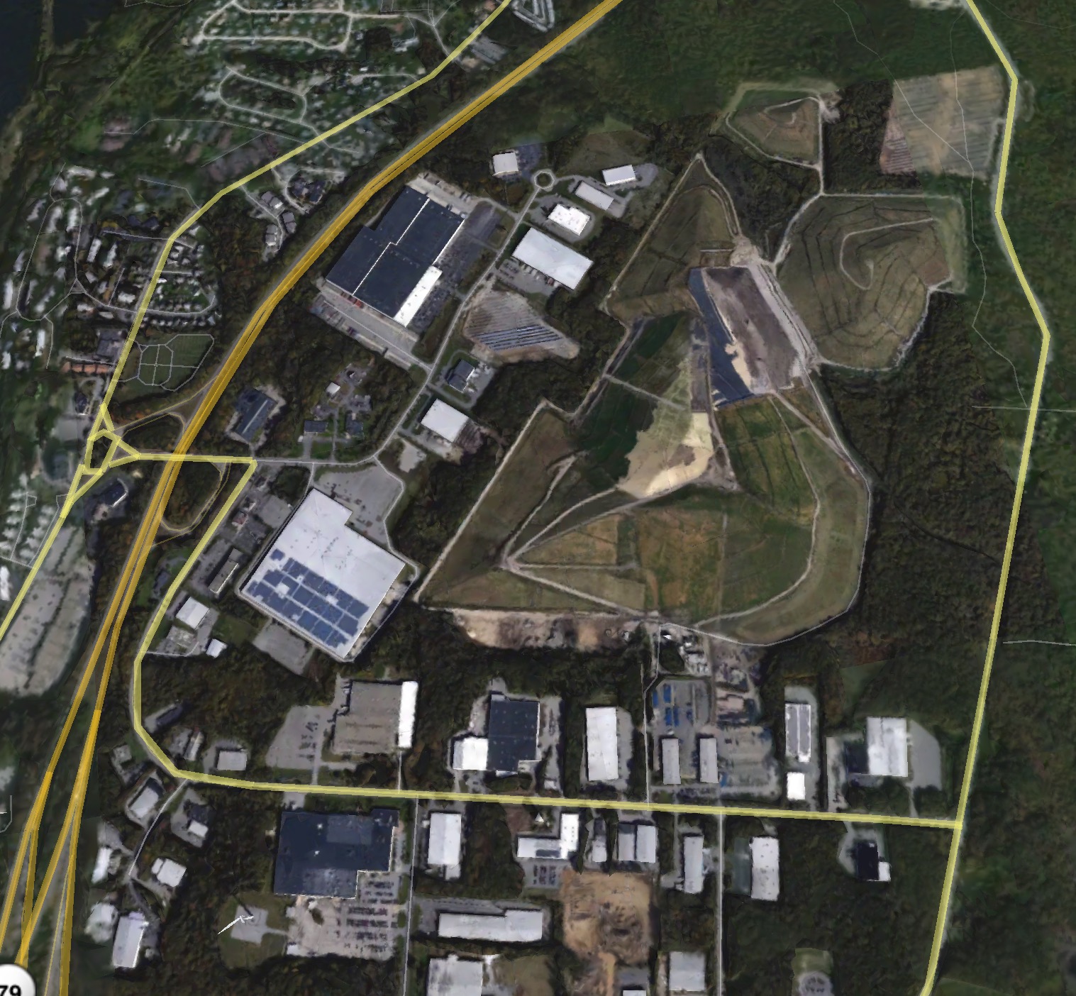
How about now?
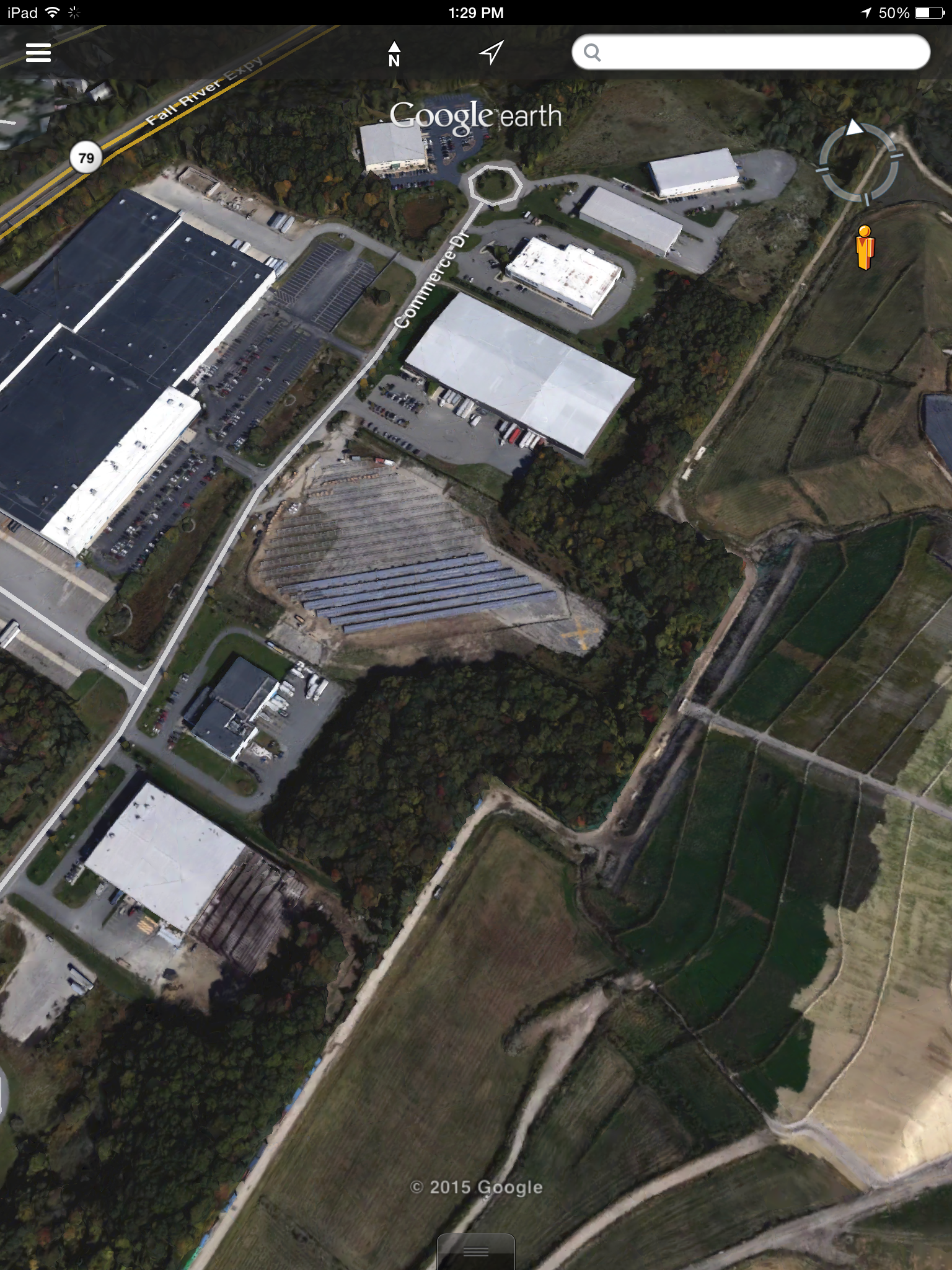
There it is! Notice the smallest piece of the former crosswind runway, marked with the ominous yellow painted-X to indicate a closed runway. Unless you knew the history of the airport being forced to close as a result of a neighboring landfill being built which created a physical obstruction and attracted too many birds, you’d likely never know where the closed airport is…
- Airport (charted) as a check point…
This point in many ways builds upon the previous one… For many years I taught ground school courses for aspiring pilots at the Mansfield Municipal Airport. The conclusion of the course was a two (2) session culminating experience centered on cross country flight planning. Much of the first session was spent going over a scenario of givens to determine if the pilot and aircraft were able to make an intended flight. Once students worked their way through these exercises it was on to planning a flight from Mansfield, MA (1B9) to Orange, MA (ORE). This cross country flight, not so incidentally, was also the first cross country training flight that students from KING Aviation-Mansfield made during their private pilot training. You’d almost think I designed it that way on purpose? 😉
One of the early parts of the flight planning exercise was selecting checkpoints for the 59-mile flight. Not too many are needed for a flight of this length, and when students looked at the chart the Hopedale Industrial Airport (1B6) always jumped out as a logical choice. A member of each class would mention the airport and I depended on this. I would then bring up Google Earth on the projector screen and show students why I would never use Hopedale as a checkpoint, if I were a new student. Having grandparents from Milford, MA I was very familiar with the Milford/Hopedale area and I knew what was around the airport, making it easy to find.
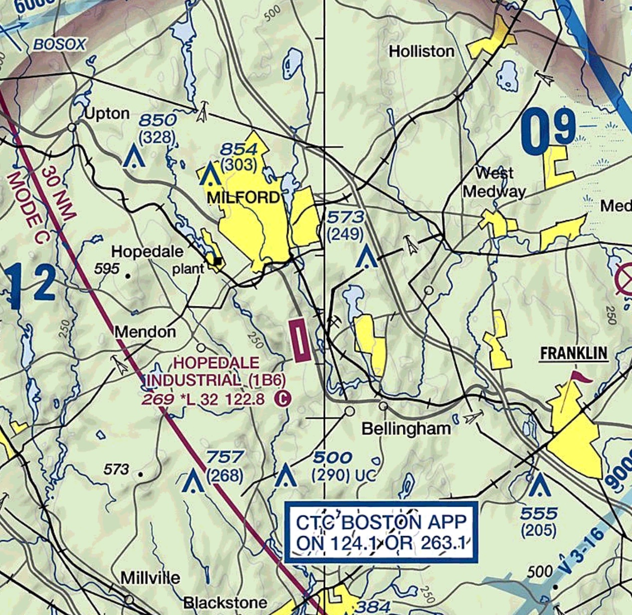
Hopedale, unlike most airports, is not easy to find from the air. This seems odd when you consider the airport has a runway that is 3200’ long and 90’ wide! What most people don’t know is that 3900′ by 90′ rectangle is really the extent of the airport hidden in a small tree dotted industrial park complex. With two hangar buildings and a small ramp, Hopedale is not easy to spot. Where many airports have large grassy areas between the runway and commonly included parallel taxiway, Hopedale not having a parallel taxiway does not have this advantage. Even further, the cleared areas around the runway are actually quite small, making it very difficult to locate the airport unless you are literally on top of it!
The close by town of Milford, MA is a much better checkpoint, the populated area, adjacent (uniquely shaped) lake and Route 495 make Milford very easy to spot and identify from the air! The takeaway here is, just because there is an airport, doesn’t mean you’re going to see it very easily from the air or that it would make a good cross country checkpoint if you do not fly directly over it. Another lesson here is to check out Google Earth in advance, find out what you’re looking for before you go looking!
These are just a couple of things that the chart shows you, but doesn’t necessarily tell you, so as Paul Harvey used to say, “Now you know the rest of the story!”
-Fly Safe, @MTElia1B9
