
Every six months, like clockwork, the FAA publishes a new set of aeronautical charts for a given area. This includes sectional and terminal area charts, the latter, where applicable. Presently, more and more pilots are electing to use digital charts, and I’ll admit, this author uses Foreflight and their digital charts as well. But, there is still some aviation romance in the good, old-fashioned, paper charts.
Terminal aeronautical charts are generally double sided, with the typical chart on one side, the other reserved for the companion VFR flyway chart, unless your area is covered by a terminal chart without such option. The Boston TAC, a regular resident of my flight bag of choice at the time, for instance, does not offer a VFR flyway chart on the reverse side. But I digress…
The smell of the special paper and the creases of a new chart bring fond memories of my early flight training as my aeronautical charts were some of my most prized possessions going everywhere with me. They’d get tucked into my school backpack and packed for trips, even when I’d be well outside of the area the charts covered and definitely not going flying. Just having them with me, having the ability to glance at them every now and then brought a smile to my young face.
Every six months since my first set of New York (sectional) and Boston (terminal) charts, I have religiously purchased a new pair, each May and November… (This is when the New York Sectional and Boston Terminal charts are published.) Typically, I’ll open the charts up, start with my familiar airports (Mansfield, Taunton and New Bedford, each important for different reasons) and then work my way out to the farthest reaches of the chart coverage area. I look for changes, sometimes I know they are coming, other times it is to see if I notice the change before taking out my older charts to compare them too…
Rarely, do major things change. Occasionally though major changes do occur, such as in the early 2000’s when the Boston terminal chart expanded to a third fold-out to include the South Coast region of Massachusetts plus the Cape and islands!
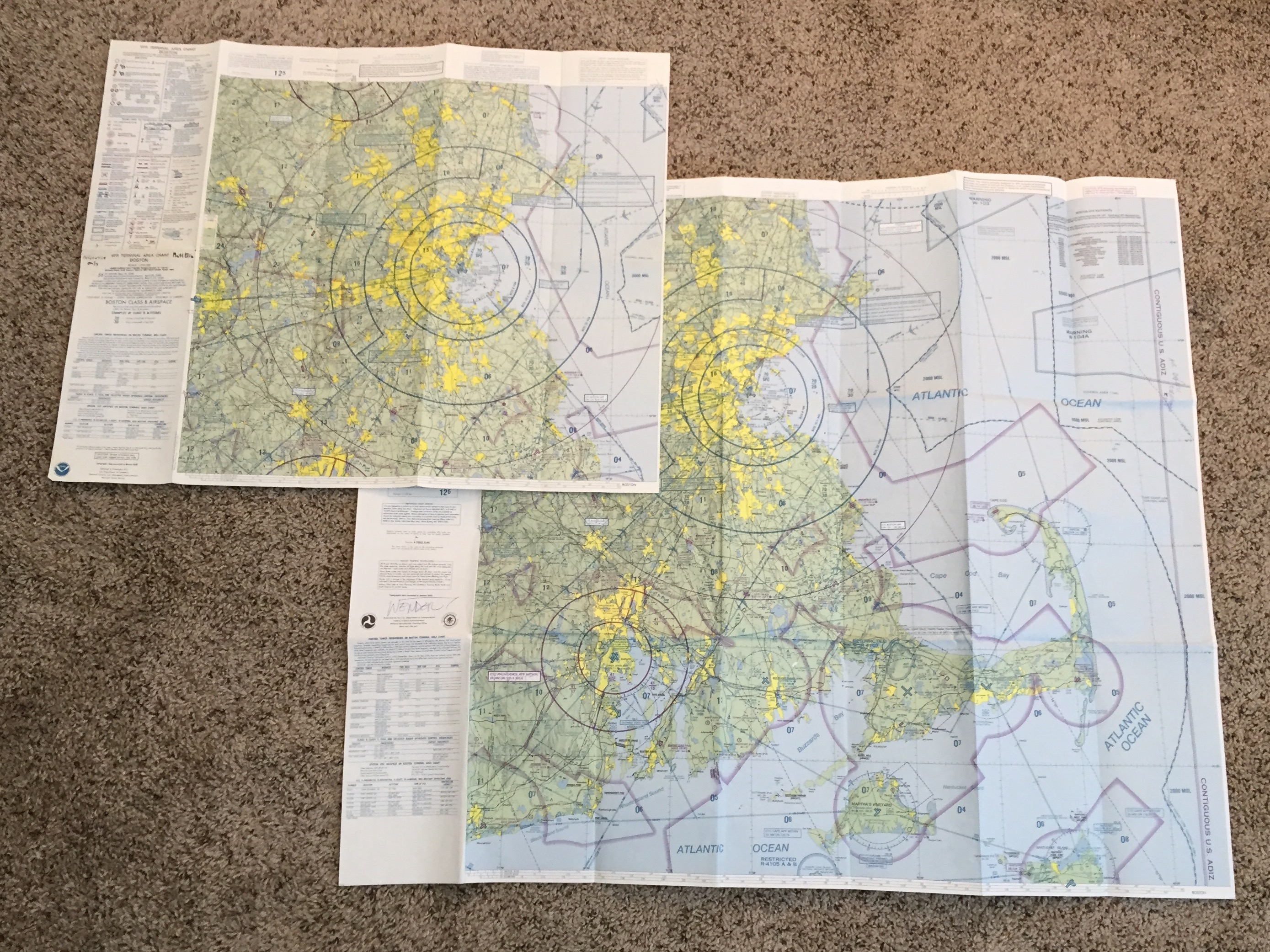
Imagine my surprise when they changed the coverage area of the Boston Terminal Chart… A change in coverage area is extremely rare!
Tucked away in a closet at my home are each of my expired charts, prized possessions, each with stories to tell. My chart collection has grown over time too… Now including instrument and visual charts from all over the United States, Department of Defense charts and even some international charts! But that’s enough about my love affair with aeronautical chart collecting, let’s take a look at some advanced symbology knowledge that will impress other pilots, your flight instructor or your flight examiner! These are things that any pilot would be well served to know about charts!
Did you know that there are ONLY 4 things actually shown on aeronautical charts? Can you name the categories? If you can, good work you did the extra studying to set yourself apart from the rest of your private pilot ground school course! If not, and this is likely the majority of the readers, here are the four categories of information included on charts for us pilots:
- Aeronautical
This includes all of the items we’re usually looking for: airports, airspace, radio/navigation information, etc… Consider this information as the content that separates aeronautical charts from auto maps.
Everything from the location of airports and navigation facilities (VORs and NDBs) to the details associated with these times. Each airport is accompanied by the information box which tells pilots the name of the facility, the runway length, elevation and frequency. The information box can also include any nonstandard traffic pattern information as well as additional frequencies or interest such as ATIS/ASOS/AWOS and the Unicom at towered airports.

While a road map emphasizes roads and also includes the locations of physical features such as mountains, rivers, etc… Aeronautical charts show pilots what they will see out the window and provides the key information needed for the included aeronautical-related facilities such as airports, navigation facilities, etc…
Keep in mind an aeronautical chart is not a map, one of the key differences is a driving map could be thought of as the “view from above,” whereas aeronautical charts provide a 3-dimensional view of an area for pilots. Not only do aeronautical charts show the “view from above” showing the ground, but they also provide pilots information on the airspace that lays above these items on the ground. Everything from Class Bravo, Charlie, Delta and Echo airspace areas surrounding airports and extending upward from the ground, to the massive areas of Class Echo and Gulf airspace not associated with specific airports.
An aeronautical chart provides the 3-dimensional view necessary for flight planning. When a course line in drawn on a chart, it isn’t just to see what will be below the aircraft and by how far, it is also to show the types of airspaces that will be traversed. This gives pilots an idea of what will be necessary for planning purposes to ensure proper flight procedures are followed.

The “Bay Area” in California is a perfect example of the “3-D” capabilities of an aeronautical chart. Pilots can look at this and have a fundamental understanding of what a flight through the area will entail in terms of equipment needs and required communications…
- Culture
Culture includes items such as populated areas, roads and railroads…
The populated areas, which are colored yellow, give pilots an idea of where during the day you’re more likely to see buildings and structures other than trees. Similarly, at night a pilot is likely to see lights in these areas, and in major metropolitan areas, a “glow,” similar to the yellow coloration on the chart.

In this chart excerpt from Long Island in New York it is easy to spot where the populated areas lie and what a pilot might expect to see during the day (populated areas) and at night (lighted areas).
Roads can often serve as great checkpoints, especially divided highways. This topic often leads to the debate on which way an emergency landing should be made on a highway. Whether with or against traffic or in the median, each method has upsides and downsides and really isn’t something I’m interested in getting into in this space…
In any event, railroad tracks on the other hand have a tendency to be less than desirable as compared to highways, unless you are flying across the track on a perfectly perpendicular path… Think about the difference between a highway, which has multiple lanes, a median and cleared areas on either side of the road and a railroad track which is much more narrow with small cleared areas on either side of the narrow tracks. The cleared area is often much less for rail tracks, which result in making them more difficult to identify from the cockpit.
- Hydrography
As the term would indicate, these items are related to water. Items such as shorelines, lakes, reservoirs, streams, etc…
In most places the lakes, ponds and bodies of water are uniquely shaped making them ideal checkpoints for pilots. Whether it is planned on an old-fashioned flight plan form or just a quick informal position confirmation, bodies of water provide a great source of situational awareness for pilots.
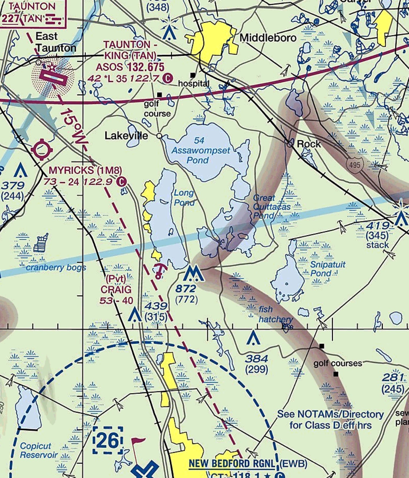
This look at the “Practice Area” just north of my home airport shows the detail with which bodies of water are diagramed for use as checkpoints. Also note the elevation of Assawompset Pond is shown for those of us that fly around with floats under our wings…
On a Terminal Area Chart, where the level of “zoom” or scale is appropriate the names of large lakes are often listed, including, if you look closely the elevation of the water! This took me a little while to figure out, how you could have a lake with an elevation Above Sea Level (ASL)! Great information for those of us pilots that regularly, occasionally or rarely fly around with floats hanging around under their planes.
- Relief
This component of the charts includes contours, elevations, etc… This shows pilots the shape of the Earth’s surface below them.
If you’ve spent any time flying around areas where the elevation isn’t perfectly flat, or if you’ve at least looked at a chart from an area with varying elevations, you’ve noticed the effects that chart makers use to show elevation. The very basic method the cartographers use is different colorations starting with light green shades and progressing to darker browns, with white reserved for glaciers, for our friend who fly in much colder locations…
The much more subtle elevation indication is shading along areas of peaks, ridges and relief. These shadows show us pilots where the ridgelines are and what we might expect to see. These ridges are ALWAYS highlighted with shading that is drawn as if the feature was lit from the northwest. The idea is that the carpophores are showing us how these areas of relief might look from the air. Think of the difference between the “map” mode and the “hybrid” mode on electronic everyday maps…
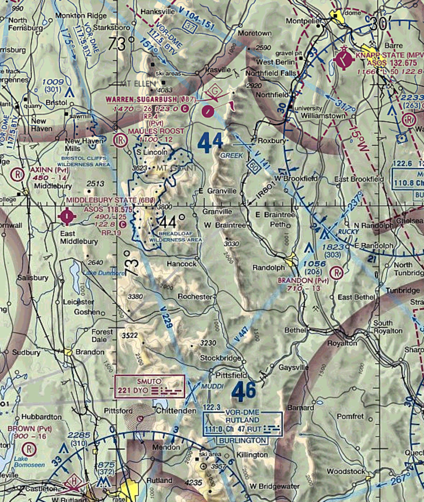
The ridge line in the center portion of this image is a great representation of the “shading” the cartographers use to illustrate physical peaks!
In the next edition of “The Art of the Aeronautical Chart,” we’ll explore the difference between what is seen on a chart and what is actually seen out the window of the cockpit! Including some things many pilots overlook and don’t realize…
-Fly Safe, @MTElia1B9

Quite an interesting article..very informative..looking forward for the next part to come..Thank you for such a wonderful experience..
Reblogged this on achintyad's Blog.